“I like it….but it looks like there’s not enough words on the page.”
So said a participant in one of my recent Presentation Writing workshops as he studied my suggested improvements to a PowerPoint slide that was originally overrun with text.
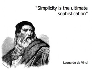
Simplicity.
In a presentation, simplicity means a well-organized, inspiring message. A clean, delightfully revealing chart. A well-structured, informative table. A thought-provoking image. And, yes, even a simple page of unmistakably clear, hard-hitting text.
Importantly, this does NOT mean “dumbing down” our content, omitting important findings, being purposelessly bland, or writing in choppy, incomplete sentences. Simplicity and insight are complimentary, not mutually exclusive.
Our inability to recognize these differences is one reason why so many PowerPoint pages resemble a “Where’s Waldo?” illustration, with the main message lost in unnecessary information and decoration.
Simplicity.
We claim to embrace it. Let our deeds match our words.

