Do we have Big Data backwards?

A client recently shared an article from Supply Chain Management outlining five leading Supply Chain trends. The fifth trend was the increasing importance of “Big Data.” And while not spelled out specifically by the author, the first four trends are also all heavily data-dependent. It’s hard to argue: “Big Data” is all the rage.

But is this right?

No, I’m not seeking to revive the debate over intuition and analysis (Blink vs. Freaknomics, anyone?). My point is that the issue isn’t one of BIG data, but rather BETTER data. We don’t need data that is more plentiful, we need data that is more revealing. We don’t need more hay, we need the needle within it. The value isn’t in more data, it’s in better questions upfront that define the data we need, and it’s in more revealing analysis of that data – whether that data is “big” or “small.” This is what leads to better insight, better decision making, and competitive advantage.

As we seek to better “connect the dots” in our work environments, we need to remember: the data are the dots; the analyses are the connecting lines. I’d rather have fewer dots that are meaningfully connected, than more dots that aren’t.

Posted in Problem Solving | Leave a comment

Intuition vs. Objectivity? And the winner is…

Two weeks ago I wrote about an interesting experiment in the Wall Street Journal to compare intuition versus objectivity in picking winners in this year’s NCAA men’s basketball tournament. The intuitive method was straightforward – pick the winner of each game using your instincts, biases, likes and dislikes. The objective method designed by the Journal required you to predict winners knowing only certain information about the teams (e.g., experience, height, 3 point shooting ability, etc.), but not the specific identity of the teams. I decided to play along.

So, two weeks and sixty games later, how did I do? Or rather, how did my instincts do versus my objectivity? Drum roll, please…

In those games where the methods resulted in my predicting different winners, I picked the correct outcome four times using my instincts versus three times using objectivity.

What conclusions can we draw? Does instinct trump objectivity? Hardly.

The first thing that jumped out – which I noticed before a single game had been played – was the extremely limited sample size. I predicted different winners in only seven games!

So, was there anything unique about those seven games that might prove enlightening? As a matter of fact, yes: all seven of those games involved teams seeded between five and twelve. That is, they didn’t involve any top four seeds (and thus no bottom four seeds). And it’s important to note that while I didn’t know the identity of the teams using the Journal’s method, I did know the team’s approximate seeding (the Journal gave the team’s seeding within a range of two (i.e., “a 1 or 2 seed,” “a 5 or 6 seed,” etc.). Of the 32 first-round games, I picked the lower seed to win only twice by instinct and only four times by objectivity. Clearly, seeding heavily influenced my selections in both methods, and thus this really wasn’t a comparison of intuition versus objectivity.

There’s much more we could explore in this comparison, but in the interest of brevity I’ll end here with the following thought: intuition and objectivity are extremely difficult, if not impossible, to separate. Intuition is the interpretation of our past experiences (including lots of factual data). Objectivity often requires that we choose among competing measures and sources of data, which we can attempt to do scientifically, but often times we do because something feels better.

The debate of objectivity versus intuition, while interesting, really isn’t an issue of either or. And in designing experiments to explore it, we need to be especially mindful of how the two are often entangled.

Posted in Uncategorized | Leave a comment

The NCAA tournament: Intuition vs. Objectivity

It’s mid-March, which of course means the NCAA Basketball tournament and the detailed analysis that drives our bracket predictions.

Uh, wait….detailed analysis?

Do we really analyze the teams and matchups in forecasting the outcome of the tournament? Or do we rely on our instincts and simply guess? Do we even know how much of each is involved in our selections? Most important, which is better – instinct or data-driven analysis?

I found a fun way yesterday for us to test ourselves, at least in the case of this year’s NCAA tournament. Fill out your bracket by your traditional method (presumably relying heavily on instinct?), then go to WSJ.com/sports and complete their “Blindfold Brackets.” The Journal has replaced each tournament team name with a random inanimate object (e.g., “The Quilts”) and provided a number of characteristics that describe the team (e.g., the team’s experience, height, three point shooting, etc.) without giving away its identity. You pick the winner of each matchup based on those characteristics. The process isn’t perfect (are the Journal’s characteristics the best predictors of the outcome of a game? Is their assessment of each team on each characteristic accurate and differentiating?), but it’s intriguing enough for me to test it.

At the conclusion of the tournament I’ll compare my traditional and blind brackets to see where I did best and share my findings in another blog post.

Maybe experiments like this will demonstrate that objectivity really does beat intuition? Maybe then we might start seriously using objective methods in our everyday professional decision making. Maybe we’d look not at the name, but rather the defining characteristics of different companies that we decided to pursue as business development prospects? Maybe then we’d do the same as we evaluated and promoted our employees? Or in deciding among investment options? Or projects to pursue?

Maybe.

Posted in Uncategorized | Leave a comment

The best thing that can ever happen to a Presentation

I spent a little time this evening catching up on the Sunday morning talk shows (via DVR, of course). I watched the various pundits debate the pickle the Republicans now find themselves in due to tropical storm Isaac deciding to attend their convention. Previously scheduled to start Monday, this four day affair has now been “condensed” to just three days.

Oh no! What to do? How can we possibly squeeze four days of discussion into three?

I’m not joking in the least when I say: this is the BEST possible scenario for the GOP. Any time you are forced to shorten a presentation, you are better off. It’s amazing how we always see less time as curse. Yes, it takes effort to shave and whittle down your message, but it’s almost always better as a result.

For your next presentation, pretend Isaac is coming. Lop 25% off your presentation, just as the Republicans are doing now. You’ll think more intensely about what really matters, form a more direct message, and be less rushed in your delivery. And you’ll most certainly exceed the expectations of the audience, who will thank you for the time you’ve given back to them.

My guess is this week’s convention will earn high marks, certainly higher than expected. Few, if any, will attribute this to the loss of Monday, but it WILL be a key reason.

Posted in Presentations | Leave a comment

Keeping momentum

It’s been an embarrassingly long time since I last posted.

For me, blogging is an important routine, or habit, I try to maintain, just like exercising, healthy eating, doing crossword puzzles and reading the daily business press. These are activities that provide long-term but few short-term benefits, at least not many that are measurable. And as a result, it’s easy to “fall off the wagon,” to set aside these commitments to tend to short-term emergencies, indulge in other distractions, or just enjoy some personal down time.

But these sabbaticals, if you will, aren’t free – when I don’t blog, I lose connection with my network; when I skip my crossword puzzles, my thinking softens; when I don’t read the paper, I’m less aware, less curious, and may miss business opportunities; when I don’t exercise or eat right, ….. you get the idea.

What’s worse, it’s often hard to restart our good habits – “I’ll start my diet next week,” “I don’t have time to do the crossword today,” “I don’t have anything worth blogging about.”

We all have our own long-term goals. Typically their achievement depends to a large degree on our steady, long-term commitment to some set of small, regular activities. Skipping them, here or there, once in a while, doesn’t seem to matter much, until the skipping becomes the routine. Understanding the connection between our long-term goals and short-term habits helps us stay on a steady course, and achieve our goals.

Anyone for an early morning run tomorrow?

Posted in Uncategorized | Leave a comment

Working the data to find the needle in the haystack

“That was a fun exercise. But we never have data like that in the real world.”

So said a participant in one of one of my recent workshops on Problem Solving, referring to a data field that allowed him to sort Legal expenses by the type of work performed (e.g., Regulatory, Intellectual Property, etc.).

“Why not?” I asked.

“We just don’t capture it,” he said matter of factly.

Yes, but there’s no reason why we can’t fill in that missing information. Sometimes, it’s a matter of adding a column to our database and combing through, in the case of my Problem Solving exercise, invoices, to enter the data values case-by-case. In other instances we might use a logic function in Excel to designate each line as belonging to a particular subgroup when certain conditions exist. In others still, we might run a survey to obtain the missing information.

This takes time, of course, but going this extra mile is often worth it, allowing us to convert a single, large universe of mixed data into smaller subsets that enable more revealing, apples-to-apples comparisons. In my case exercise, comparing two law firms who do entirely different work will yield no insight at all, or worse: faulty conclusions. But when we can sort the legal work by type of case, now we can compare the efficiency and effectiveness of the law firms involved.

When you look at data, consider not only the fields available, but also those that aren’t – those that would truly empower your analysis. Think creatively how you’d capture that critical information. Then go do it.

This is what makes your analysis special. It’s what makes you an exceptional Problem Solver. It’s what’s sorely needed to “find the needle” in a world of proliferating hay.

Posted in Problem Solving | Leave a comment

What do you do with expert advice?

The week before last on American Idol, Tommy Hilfiger was brought on to the show to provide fashion advice to the contestants. As usual, industry icon Jimmy Iovine, was there to offer musical wisdom.

Tommy did not approve of the wardrobe plans of contestant Philip Philips, turning his nose up at the gray outfit Philip had chosen. Philip wore it anyways.

Jimmy shook his head in disapproval during rehearsals, advising Philip to sing without his guitar. Philip chose to stick with his guitar.

So what happened?

Philip rocked the house in his gray outfit, banging away on his six string.

I smiled and cheered from the sofa – it’s not often that we trust ourselves in the face of opposing advice from recognized experts.

Perhaps we should do this more often?

The more common response is to simply follow what we’re told – to not think for ourselves. We couldn’t possibly make a better decision than the subject matter expert, or the CXO, right? At a minimum, we should listen and evaluate the advice critically, rather than just accepting it blindly.

Especially if you get fashion advice from a guy wearing red socks.

Posted in Problem Solving | Leave a comment

“…but if I leave that data out, I get….”

As March draws to a close, so do my posts on histograms. There are two important benefits of using histograms still to cover.

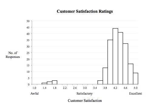
The first is in identifying extreme data. Histograms help us quickly see these points – and the degree to which they are unique. Sadly, we often cast this data off as outliers. We think because it differs from the rest, there must have been some error in recording it, or it’s just due to some random, inexplicable event. This becomes easier when the remaining population better fits our desired outcome. Consider the following set of customer satisfaction ratings.

It’s easy to disregard those few ratings with scores less than two. We say to ourselves, “Those customers must have misinterpreted the scale,” “Those can’t be right,” or “Oh well, you can’t please everyone.” But we’d be much better off exploring those points in detail. What do they have in common? Were they all from a certain type of customer? Did they all involve interaction with a particular employee? Did they all occur on a certain day of the week, or time of day? We need to learn from these important outliers. And histograms help us find them.

Additionally, histograms help us understand the variance – or “spread” – in the data. We could, of course, do this by calculating a standard deviation, but the histogram provides an immediate visual sense for this variation, as highlighted below.

This matters because the consistency of our data provides insight on the consistency of our people and the processes that produce it. Have we designed an approach that thrills our customers? Are our employees applying it uniformly? How confidently can we use this data to predict the future? Histograms provide a quick, visual, first-pass answer to these questions, helping us better understand what’s working and what’s not.

I declared March “Hug a Histogram” month. Just like holiday spirit, try extending it throughout the entire year.

Posted in Problem Solving | Leave a comment

The histogram – the honey badger of statistical tools

I’ve dedicated my posts this month to showing you why the histogram is the Honey Badger of statistical tools. The histogram looks deep into our data, helping us see patterns, raise probing questions and identify causal relationships.

One of the many areas the histogram helps is in determining an appropriate sample size. In statistics, we’re often told that a sample size (N) of thirty or more is statistically significant. But the right answer really depends on the nature of the data and how we intend to use it. Typically we want to use data to make predictions. For these purposes, we need to know more than just the sample size. We need to understand the data. Again, the histogram helps.

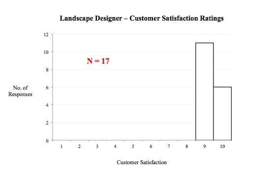
Consider the following two histograms showing customer satisfaction ratings of two different Landscaping companies. The first has a sample size of 85, the second only 17.

If we were predicting the satisfaction level of the next customer for each of these two companies, in which prediction would we be most confident? Clearly, we’d be more comfortable forecasting a ‘9’ or ‘10’ for the customer of the second provider, even though it’d be based on a much smaller sample size. That’s because the sample contains very little variance. Over and over again the second provider delivers great service. The histogram clearly illustrates this.

To borrow Randall’s words, “the honey badger (histogram) is crazy; it’s bad @#%!!

Posted in Problem Solving | Leave a comment

Histograms – the findings aren’t always so obvious

In each of my last two posts, I showed how histograms help identify distinct subgroups in our data, focus our analysis, and produce more powerful findings. I used real-world examples, but made-up data.

Why?

Because real-world data is messy, often full of random noise, and with odd proportions, making it less-than-ideal for illustration purposes. This is not a limitation of the histogram, but rather a challenge for us as we use them.

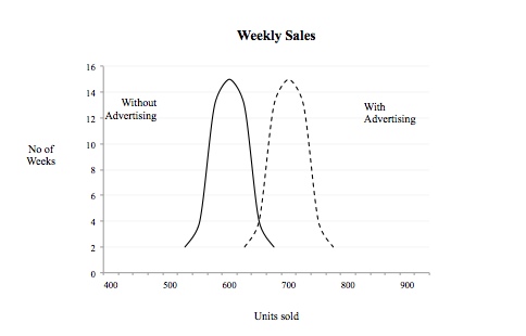
Consider the following example exploring the frequency of a product’s weekly sales.

As you can see, our data breaks cleanly into two distinct subgroups – weeks when we advertised the product, and weeks when we didn’t. As you’d expect, we sell more when we advertise – in fact, a lot more, making it easy to see these two subgroups.

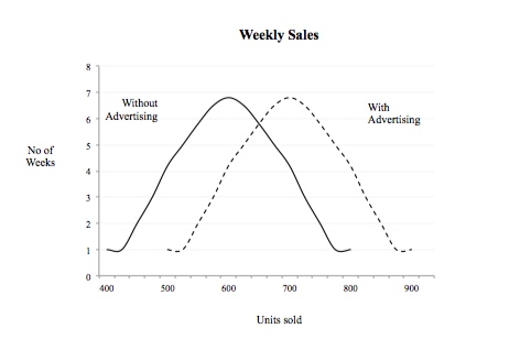
But what if our advertising was less effective? And what if our product had a higher base sales level? The two subgroups still exist, but they’re less distinct, as in the following histogram.

Now let’s assume there was greater variance in weekly sales, due to any number of factors: volatile consumer demand, product stock-outs, uncertain economic conditions, etc. Our weekly sales would be less consistent and distributed more broadly as below (note: this would be true both when we advertise and when we don’t).

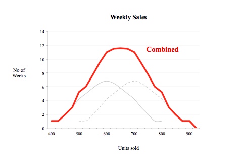
What happens when we look at the data not as two subgroups, but as one population? Our two subgroups add together to create the following overall sales distribution (the red line).

Hey, wait a minute! This looks like a homogenous, normally distributed set of data!!

It’s important to note, in the real world, THIS is the view we’d start with. We only get to the more revealing views of sales with and without advertising, when we imagine the differences, sort the data, and run a histogram to compare the two subgroups. Looking at the above combined view, it’s easy to see how this can be missed.

The histogram is a great analytical tool. But like most tools, batteries aren’t included – tools don’t work on their own. Thinking on our part gives it its power.

Posted in Uncategorized | Leave a comment