Remember: March is “Hug a Histogram” month

In my last post I extolled the virtues of the histogram and proclaimed March “Hug a Histogram” month. It seems only fitting then that I dedicate another post or two to the benefits of using histograms – and the costs of not doing so.

I recently came across a great, real world example in Michael Lewis’s wonderful book, “The Big Short,” which tells the story of a few, very sharp individuals who foresaw the pending collapse of the mortgage securities market and made a fortune betting on its inevitability.

As Lewis tells the story, mortgages were being moved off the books of banks, packaged together into bonds, then sold to investors. The price of those bonds depended on the rating agencies’ assessment of its risk, which they calculated by taking the average FICO score of all its underlying mortgages (a FICO score is a numerical assessment of the credit worthiness of the borrower). If the average FICO score was 615 or higher, the bond received the highest possible rating (AAA). It didn’t matter the distribution of the individual FICO scores in the bond, the rating agencies cared only about the average. Yes, the AVERAGE.

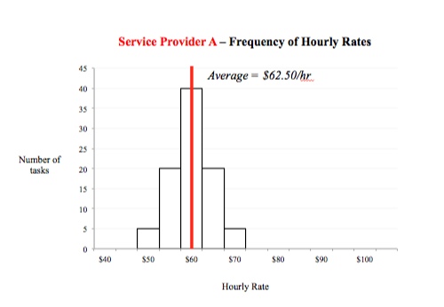
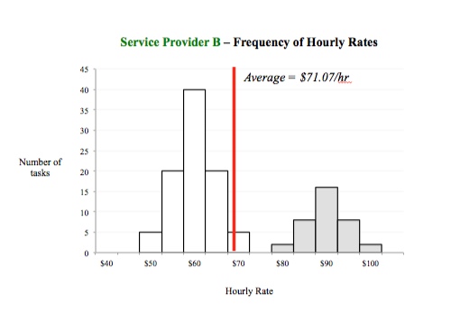
Under this approach, two bonds with the following distribution of FICO scores were both rated AAA.

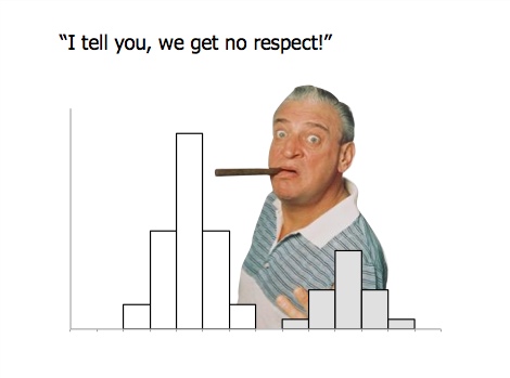
Clearly, these bonds have very different risk profiles – the “hump” of mortgages representing low FICO scores in the second makes it much likelier to default. And, of course, many just like it did! Yet the agencies saw average FICO scores of 615 and rated both AAA. And thus more and more mortgages were packaged and sold – wash, rinse, repeat – with investors blind to the risk all the while. What a mess.

Please, make the histogram part of your analytical tool kit. The costs of not doing so can be very painful!


Posted in Presentations, Problem Solving | 1 Comment

Embrace the histogram

Let’s say we are comparing two suppliers of some service to our business – any service: Temp Labor, Facilities Management, Security, IT, etc. One important measure is each supplier’s hourly rate. This may vary based on the seniority and skills of the staff, the task performed and the location of the work.

We start by gathering a large sample of invoices from each supplier so that their collective work is identical. That is, the hourly rates still vary, as per above, but the variation is identical for each supplier. Given this, how would we compare the supplier’s hourly rates?

The obvious answer is to take an average.

Fine. So we do that and find supplier A’s average hourly rate is $62.50/hour and supplier B’s is $71.07. Is there any other analysis we would do?

Anyone? Anyone? Bueller?

Most of us would stop there and conclude that supplier B is pricier.

But we’d be better off if we first looked at a histogram of the data. The histogram, as you may recall, looks at the frequency of different values. How many tasks were billed at $60/hr? How many at $65/hr? And so on up and down the range.

Here are histograms comparing suppliers A and B in my hypothetical example:


The average hourly rate of the two suppliers is different, but is supplier B truly pricier than supplier A? What is going on in that subgroup of tasks performed by supplier B at higher hourly rates? If you look close enough, you’ll see those tasks are distributed evenly around $90/hr., whereas the larger, remaining set of tasks are distributed evenly around $60/hr. Yes, that’s it, those higher priced tasks were performed on overtime, at a 50% premium.

Supplier B is NOT more expensive than supplier A, they’ve just performed a bunch of overtime work. This could be for good or bad reasons. Were they slow in their work, and were always behind schedule? Or, are they the more reliable supplier we turn to when the going gets tough?

Who knows? What’s important is that those questions would never have been asked, and we’d have settled on an incorrect conclusion, if we hadn’t looked at our histograms.

Sadly, the histogram is terribly underutilized. So I proclaim March Hug a Histogram month. Next time you’re looking at a set of data, please be kind and run a histogram. You might be surprised by what you see.

Posted in Problem Solving | Leave a comment

Simplicity: the missing ingredient in most presentations

“I like it….but it looks like there’s not enough words on the page.”

So said a participant in one of my recent Presentation Writing workshops as he studied my suggested improvements to a PowerPoint slide that was originally overrun with text.

Simplicity.

In a presentation, simplicity means a well-organized, inspiring message. A clean, delightfully revealing chart. A well-structured, informative table. A thought-provoking image. And, yes, even a simple page of unmistakably clear, hard-hitting text.

Importantly, this does NOT mean “dumbing down” our content, omitting important findings, being purposelessly bland, or writing in choppy, incomplete sentences. Simplicity and insight are complimentary, not mutually exclusive.

Our inability to recognize these differences is one reason why so many PowerPoint pages resemble a “Where’s Waldo?” illustration, with the main message lost in unnecessary information and decoration.

Simplicity.

We claim to embrace it. Let our deeds match our words.

Posted in Presentations | Leave a comment

Better Decision Making

The quality of a decision depends on the information available at the time of the decision, not the actual outcome that occurs later. As long as we decide consistent with our values, given what we know at the time, we’ve made a good decision.

A couple of weeks ago, my wife bought a new laptop (her first MacBook Pro!). She chose to buy the extended AppleCare warranty. The sales assistant (oops, I mean “Genius”) helping us said, “Good choice. I declined coverage on my last laptop and the screen went bad shortly after the basic warranty ran out. I’ll never make that mistake again!”

Really? Why? Have the odds of the laptop failing suddenly changed? Of course not. So why would it now make sense to buy an extended warranty for every laptop you purchase for the rest of your life? It doesn’t.

If you walk into a casino, bet the number 31 on the roulette wheel, and win, would you keep doing that all night? You might, but it wouldn’t mean that you were any more likely to win than when you started.

We like to think of ourselves as objective, rational beings. But we’re not. We can’t help but be influenced by our past experiences, not to mention our emotions, biases and other decision-distorting preferences. Awareness of these natural weaknesses is the first step to making better decisions.

Better data helps, too.

Posted in Problem Solving | Tagged | Leave a comment

Picking the right chart

Selecting the right chart type and designing it well is essential in clearly communicating our analytical findings.

I’m Captain Obvious, yes, I know. But we often get this wrong.

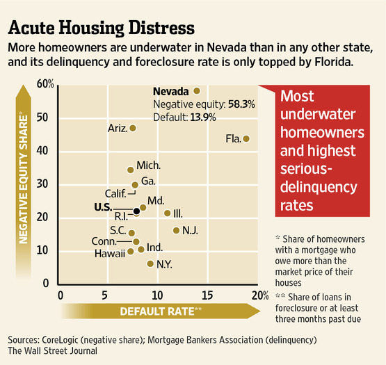
Last week I came across the following chart in a Wall Street Journal article describing the dire state of Nevada mortgage holders.

What is the primary message we should take away? Or per the title of my blog: So What?

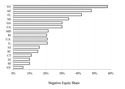
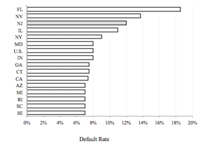
I think the author’s point is that Nevada is far worse than other states on two important housing measures: home equity and foreclosure percentage. But if so, this would be better communicated using two separate bar charts.

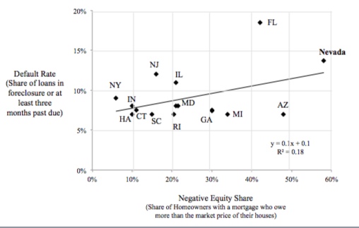
My guess is the author chose the scatter plot to improve the “insight per chart,” if you will. But in doing so, he/she also added complexity and confusion. Scatter plots are used to illustrate the correlation between two variables, usually with the assumption that a cause-and-effect relationship exists. That could certainly be the case here. I imagine negative equity in one’s home increases the likelihood of foreclosure. But if this were the point, the independent variable (negative equity) should be on the x-axis and the dependent variable (foreclosure rate) on the y-axis, as here.

But now we find a low correlation. That’s because we have the wrong variables. Rather than show the percent of homes with negative equity, we should show the actual amount of negative equity. In other words, the foreclosure rate is unlikely to be very different between a state with a small percentage of homeowners with a very small percentage of negative equity and a state with a large percentage of homeowners with the same very small percentage of negative equity. The death grip of foreclosure wouldn’t have yet kicked in. But if the second state had homeowners with a large amount of negative equity, you would expect a higher foreclosure rate. So, we care not so much about how many homeowners are under water, but how far under water they are.

In the end, this chart contains some interesting information. But it’s easily lost because the author – however well meaning – has chosen the wrong chart, (most likely) the wrong variables, and designed it poorly.

Picking the right chart matters. Committing the simple guidance on page 27 of Gene Zelazny’s excellent book “Say It with Charts” to memory would greatly reduce these errors.

Posted in Presentations, Problem Solving | Leave a comment

Video in communication…and analysis

In a blog entry last week, Seth Godin shared the following clip illustrating changes in the earth’s temperatures since 1880, and posed the question: If a picture is worth a thousand words, what’s a short video worth?

While video is unquestionably a very powerful communication tool, I believe the most important lessons from this video are analytical in nature, specifically: 1.) Challenge the starting and ending data points in any time series analysis; and 2.) Select a scale that accurately reflects the variation in the data.

To the first point, why start the time series in the year 1880? Would our conclusion change dramatically if instead we chose 1950? How about 1500? What if we went back as far as 1000, or even further? The good critical thinker will ask these questions. In the interest of keeping this discussion analytical instead of political, I’ll leave it to you to explore the answers to these questions. If you’re interested, this site will help.

To the second point, note how the colors on the map fluctuate dramatically from dark blue to brilliant red. What was your reaction viewing this? Time to buy beachfront property on Greenland, perhaps? How much does this suggest earth’s temperatures have varied during this period? The actual answer – found in a simple chart on the same website as the sample video – is about 0.8 degrees. Yes, less than one degree. Again, my intent is not to make this a political discussion, but simply to say that as viewers of the video, and consumers of the underlying data, it’s our responsibility to understand the scale in use and thus the variation in the data.

So, yes, video is indeed more powerful than pictures, charts, and words. And its role in data communication in business is ever increasing. As Problem Solvers, we need to develop an ever more critical eye in response.

Posted in Presentations, Problem Solving | Leave a comment

Siri, the great communicator

A couple months ago I stood in line at the local Apple store to buy the new iPhone 4s (I used to shake my head at people who did this, yet there I was). The purchasing process took longer than expected, so by the time I made it home I was inclined to take the family out to eat rather than to cook (I own the kitchen on the weekends).

“Hey, let’s use Siri to make our dinner plans!” (In case you’ve been on the moon the past few months and missed all the television ads, Siri is the voice-activated assistant on the iPhone).

“Siri, what’s the number for Maggiano’s?” I asked.

“I’m sorry, I couldn’t find the phone number for Mike Geonese,” Siri responded.

Hmmm.

“What’s the PHONE NUMBER for Maggiano’s RESTAURANT?” I tried again.

“I found 25 restaurants, tap the one you want to call,” Siri replied. Maggiano’s was not among them.

“What’s the telephone number for Maggiano’s restaurant on Freedom Drive in Naperville, Illinois?” I said again, attempting to refine my request.

“I found 25 restaurants, tap the one you want to call,” Siri repeated.

Stupid Siri!

When we seek data as part of our work – through Internet searches, database queries, and requests of our colleagues, clients and suppliers – how precise are we? How well are our needs understood? How well does the data we receive satisfy them?

When we provide information to our business partners – through formal presentations, meetings, email, and every day conversation – how well is it understood? Does our audience tell us when it’s not?

Siri’s not stupid. It let’s us know when we haven’t been clear. It let’s us know its limitations. This is incredibly valuable in the process of communication.

Posted in Presentations, Problem Solving | Leave a comment

Mental focus

This past week, Seth Godin blogged about how we should start the workday.

Seth’s point was that we’re better off starting the day focused on our priorities than by reacting to those of others (found in the emails, websites, etc.), where we most commonly start the day. In other words, pursue your goals when your energy and creativity are highest: the start of the day.

Seth’s point addresses timing. I recently wrote about the effect of surroundings on our thinking. Both address the quality of our thought, but what about quantity of thought?

As thinking professionals, we need to consider not only when and where we do our best thinking, but also how to sustain the act of thinking. How do we ensure the myriad sources of distraction (email being public enemy number one) are kept at bay, as much as is practically possible, so we can make the most of our mental abilities?

The answer will be different for each of us, although none will be terribly complicated.

What’s most important is that we have an answer, an approach. What’s yours?

Posted in Problem Solving | Leave a comment

Designing Data Tables

Tables are one of two primary means for sharing quantitative information (charts the other).

The first step in designing an effective table is to determine the comparison we want viewers to make. Do we want them to compare sales of a particular product from month-to-month? Or maybe variations in sales across different regions? Or stores? Or perhaps we want them to assess the accuracy of our sales forecast?

The answer determines both the data we include in the table, as well as how we arrange it in rows and columns. We should include no unnecessary data, and the data should be organized to help the viewer grasp our intended point as quickly and easily as possible. Design should always occur with purpose.

It’s amazing how often this obvious idea is violated.

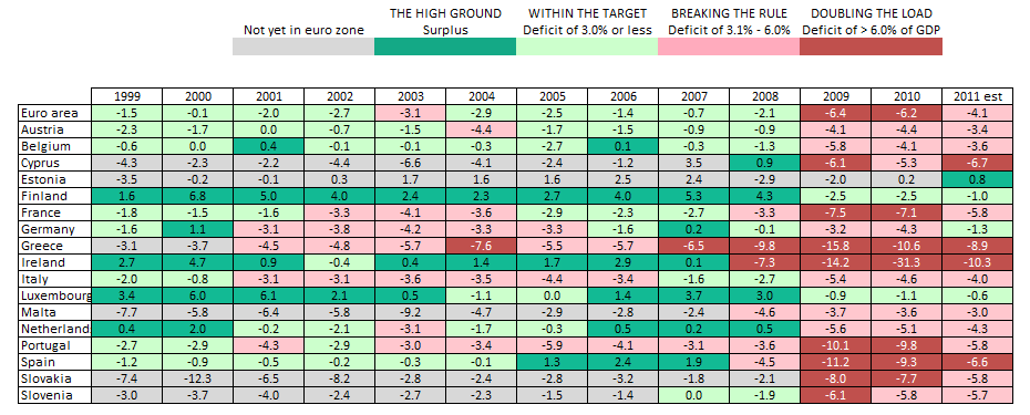
Consider the following table that appeared in the Wall Street Journal last week, showing the budget deficits of European Union members over the past ten years.

There is a lot of interesting information here. But what comparison does the author intend for us to make? What key conclusion are we supposed to reach? The organization of the rows should help us answer these questions. But it doesn’t. As you can see, the rows represent an alphabetic listing of EU countries. Ask yourself: How often do we want to compare variables because of their alphabetic placement? The answer, I think, is never (an alphabetic arrangement helps us quickly find particular data points in very large tables, but that’s needed here).

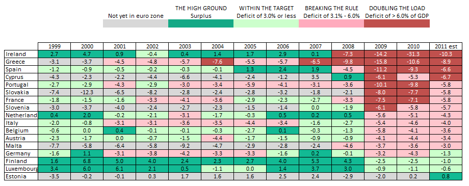
This table would be far easier to navigate with a simple reordering of its rows. If the author’s main point was to illustrate the relative health (or lack thereof) of the EU countries, the following table would work better.

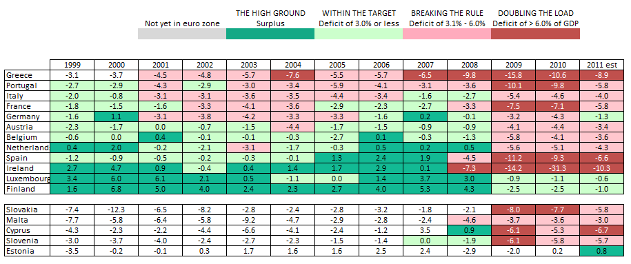
If the point was to compare the recent plight of countries based on their historic economic health, the following table would be best.

The key point is not to find the ideal look for this particular chart, but rather to emphasize that all visual design decisions must be made for a single purpose: to help our audience quickly grasp our message. Tables organized alphabetically rarely meet this vital requirement.

Posted in Presentations, Problem Solving | Leave a comment

Whitespace

What’s the first thing you do mentally when viewing a table of data?

Most of us instinctively and immediately search for the primary meaning within the data – a trend, an exceptionally unique data point, differences in subsets of the data, etc.

This is natural and good. We’re searching for insight, to understand what the designer of the table intended us to see. But too often we stop there, quickly moving on to the next serving of information provided. In doing so, we allow the boundaries of the analysis – and thus the insight we might gain – to be defined and limited by others (the author of the table, in my example).

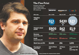
If great, independent thinking is our goal, we need to assess not only the data provided, but also that which isn’t. Why did the author include these seven specific variables? Are they the best seven? If we were to add three others, what would they be? And how might they change our conclusion?

Processing the data provided to us is easy and convenient. It’s also potentially limiting, and worse yet, promotes mental laziness. Considering what’s missing is a vital component to great thinking.

Look at the following table from the Wall Street Journal accompanying a story about GroupOn the day of its recent IPO. Are these the measurements and points of comparison you would have included?

Posted in Presentations | Leave a comment