The single, biggest step we can take to improve our presentations is to recognize the difference between a visual and a handout.
A visual is the image projected on the screen while we verbally deliver our presentation. A handout is the physical document we print and provide to our audience. They are not one and the same.
The role of the visual is to strengthen what we say during our presentation – to facilitate the connection between us and our audience. It must make our message simpler to understand, quicker to grasp, and easier to recall. It must make our message more interesting and motivating. The role of the handout is to enable our audience to recall the details of our presentation at some point in the future, without our assistance.
The visual exists only during our presentation. The handout serves as a reference manual for the future.
The visual doesn’t need to stand-alone. The handout does.
The visual doesn’t need every detail of what we say. The handout does (mostly).
The visual and the handout serve two very different purposes. We don’t always need visuals when we present, but when we do, we’re almost always better off having separate visuals and handouts. Yet more than 99% of business presentations use one document – typically an extensive set of overcrowded pages – as both visual and handout.
What problem does this cause? Consider the role of the visual as outlined above. How well does a heavily detailed page from our handout – no matter how well written – fulfill these purposes? The answer is not well. Not well at all. Not by a long shot.
When we project the information-dense page, our audience is compelled to read it. They struggle to listen to us at the same time (multi-tasking is a myth). Their comprehension is reduced. Their frustration rises. Their interest wanes. Meanwhile, as presenters, we become distracted as we see our audience squinting at the screen behind us. We can’t help but turn our attention to the screen as well – to align with our audience and account for all the details we’ve projected. Our “presentation” devolves into the dreaded “group read,” ruining the interaction between us and our audience. Sound familiar?
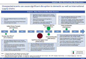
Presentations don’t have to be this way. The quickest, simplest way to change this is to develop separate visuals and handouts that meet their unique purposes. A good friend of mine recently embraced this idea in a presentation he gave on the impact of disasters – natural and man-made – on companies’ supply chains. He originally planned to use this detailed page from his handout as one of his visuals.
With some further planning, he used the following images instead, engaging his audience’s visual senses and emotions, as he simply spoke to them about the risks and economic impact of earthquakes, tsunamis and political unrest.
Follow this simple advice in your next presentation and experience the difference.
In my next post I’ll describe why so many people are reluctant to do so.


