Tables are one of two primary means for sharing quantitative information (charts the other).
The first step in designing an effective table is to determine the comparison we want viewers to make. Do we want them to compare sales of a particular product from month-to-month? Or maybe variations in sales across different regions? Or stores? Or perhaps we want them to assess the accuracy of our sales forecast?
The answer determines both the data we include in the table, as well as how we arrange it in rows and columns. We should include no unnecessary data, and the data should be organized to help the viewer grasp our intended point as quickly and easily as possible. Design should always occur with purpose.
It’s amazing how often this obvious idea is violated.
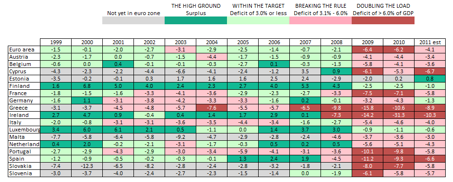
Consider the following table that appeared in the Wall Street Journal last week, showing the budget deficits of European Union members over the past ten years.
There is a lot of interesting information here. But what comparison does the author intend for us to make? What key conclusion are we supposed to reach? The organization of the rows should help us answer these questions. But it doesn’t. As you can see, the rows represent an alphabetic listing of EU countries. Ask yourself: How often do we want to compare variables because of their alphabetic placement? The answer, I think, is never (an alphabetic arrangement helps us quickly find particular data points in very large tables, but that’s needed here).
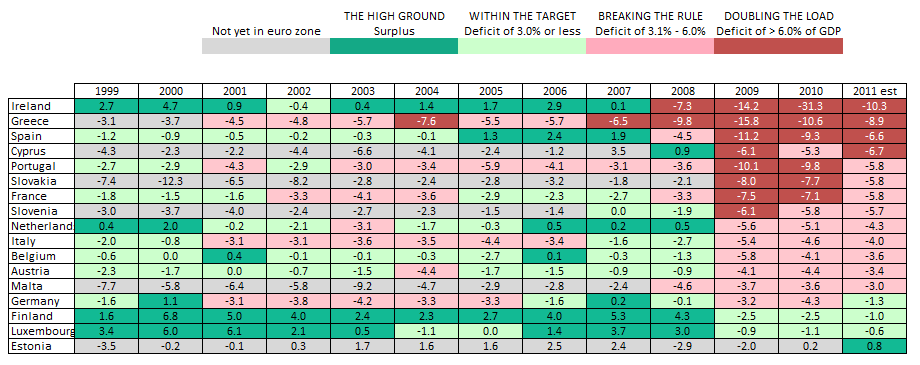
This table would be far easier to navigate with a simple reordering of its rows. If the author’s main point was to illustrate the relative health (or lack thereof) of the EU countries, the following table would work better.
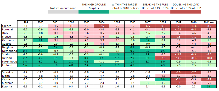
If the point was to compare the recent plight of countries based on their historic economic health, the following table would be best.
The key point is not to find the ideal look for this particular chart, but rather to emphasize that all visual design decisions must be made for a single purpose: to help our audience quickly grasp our message. Tables organized alphabetically rarely meet this vital requirement.


