Selecting the right chart type and designing it well is essential in clearly communicating our analytical findings.
I’m Captain Obvious, yes, I know. But we often get this wrong.
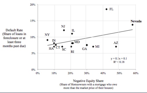
Last week I came across the following chart in a Wall Street Journal article describing the dire state of Nevada mortgage holders.
What is the primary message we should take away? Or per the title of my blog: So What?
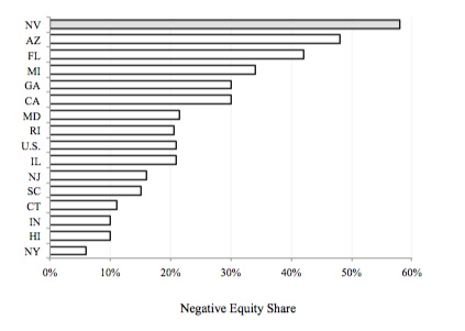
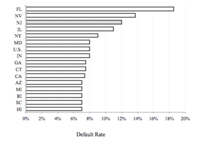
I think the author’s point is that Nevada is far worse than other states on two important housing measures: home equity and foreclosure percentage. But if so, this would be better communicated using two separate bar charts.
My guess is the author chose the scatter plot to improve the “insight per chart,” if you will. But in doing so, he/she also added complexity and confusion. Scatter plots are used to illustrate the correlation between two variables, usually with the assumption that a cause-and-effect relationship exists. That could certainly be the case here. I imagine negative equity in one’s home increases the likelihood of foreclosure. But if this were the point, the independent variable (negative equity) should be on the x-axis and the dependent variable (foreclosure rate) on the y-axis, as here.
But now we find a low correlation. That’s because we have the wrong variables. Rather than show the percent of homes with negative equity, we should show the actual amount of negative equity. In other words, the foreclosure rate is unlikely to be very different between a state with a small percentage of homeowners with a very small percentage of negative equity and a state with a large percentage of homeowners with the same very small percentage of negative equity. The death grip of foreclosure wouldn’t have yet kicked in. But if the second state had homeowners with a large amount of negative equity, you would expect a higher foreclosure rate. So, we care not so much about how many homeowners are under water, but how far under water they are.
In the end, this chart contains some interesting information. But it’s easily lost because the author – however well meaning – has chosen the wrong chart, (most likely) the wrong variables, and designed it poorly.
Picking the right chart matters. Committing the simple guidance on page 27 of Gene Zelazny’s excellent book “Say It with Charts” to memory would greatly reduce these errors.


