I’ve dedicated my posts this month to showing you why the histogram is the Honey Badger of statistical tools. The histogram looks deep into our data, helping us see patterns, raise probing questions and identify causal relationships.
One of the many areas the histogram helps is in determining an appropriate sample size. In statistics, we’re often told that a sample size (N) of thirty or more is statistically significant. But the right answer really depends on the nature of the data and how we intend to use it. Typically we want to use data to make predictions. For these purposes, we need to know more than just the sample size. We need to understand the data. Again, the histogram helps.
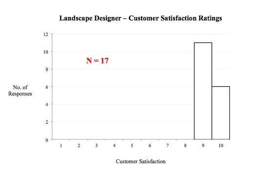
Consider the following two histograms showing customer satisfaction ratings of two different Landscaping companies. The first has a sample size of 85, the second only 17.
If we were predicting the satisfaction level of the next customer for each of these two companies, in which prediction would we be most confident? Clearly, we’d be more comfortable forecasting a ‘9’ or ‘10’ for the customer of the second provider, even though it’d be based on a much smaller sample size. That’s because the sample contains very little variance. Over and over again the second provider delivers great service. The histogram clearly illustrates this.
To borrow Randall’s words, “the honey badger (histogram) is crazy; it’s bad @#%!!


