I appreciate elegant design. And I enjoy trying something new. But when it comes to the construction of charts, sticking to basics is almost always the right answer. And for that, I always turn to Gene Zelazny’s classic book, “Say It With Charts.”
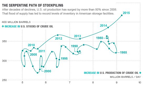
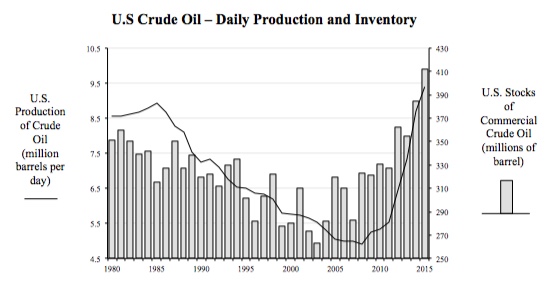
In a recent article in Fortune magazine, I found the following chart depicting U.S. Crude Oil Daily Production and U.S. Crude Inventory over the past thirty five years.
Interesting.
So, what do we make of this? Generally speaking, I can see that daily output dropped up until about 2008 before rising and slightly exceeding the level of 1980. Crude oil inventory was fairly volatile until 2008 and then began a steady rise. Yes, I can see it, but it takes a little mental processing and tracing my finger along the points and axes.
What if we just used two simpler time series charts per Zelazny’s guidance? If we did, we’d wind up with the following.
Better? It’s not as unique as the first chart, without the fancy squiggly line and all, but I can definitely see the trends, the variability and the correlation in the data all better in this version. So, yes, it’s better.
It’s always good to evaluate our options for displaying data, but we should never allow ourselves to put fanciful design ahead of the true purpose of any chart: to help the viewer make the intended comparison as quickly and as clearly as possible, with zero distortion of the data. Sticking to Zelazny’s basics will always serve you well.


