Gene Zelazny, the former McKinsey communications specialist, in his book Say It With Charts, claims that in our analysis we are really making only one of five types of comparisons:
1. Time Series: How a variable changes with time
2. Rank: How a variable compares in size to others
3. Component: How a variable breaks down into its subcomponents
4. Frequency: How common are different values for a particular variable
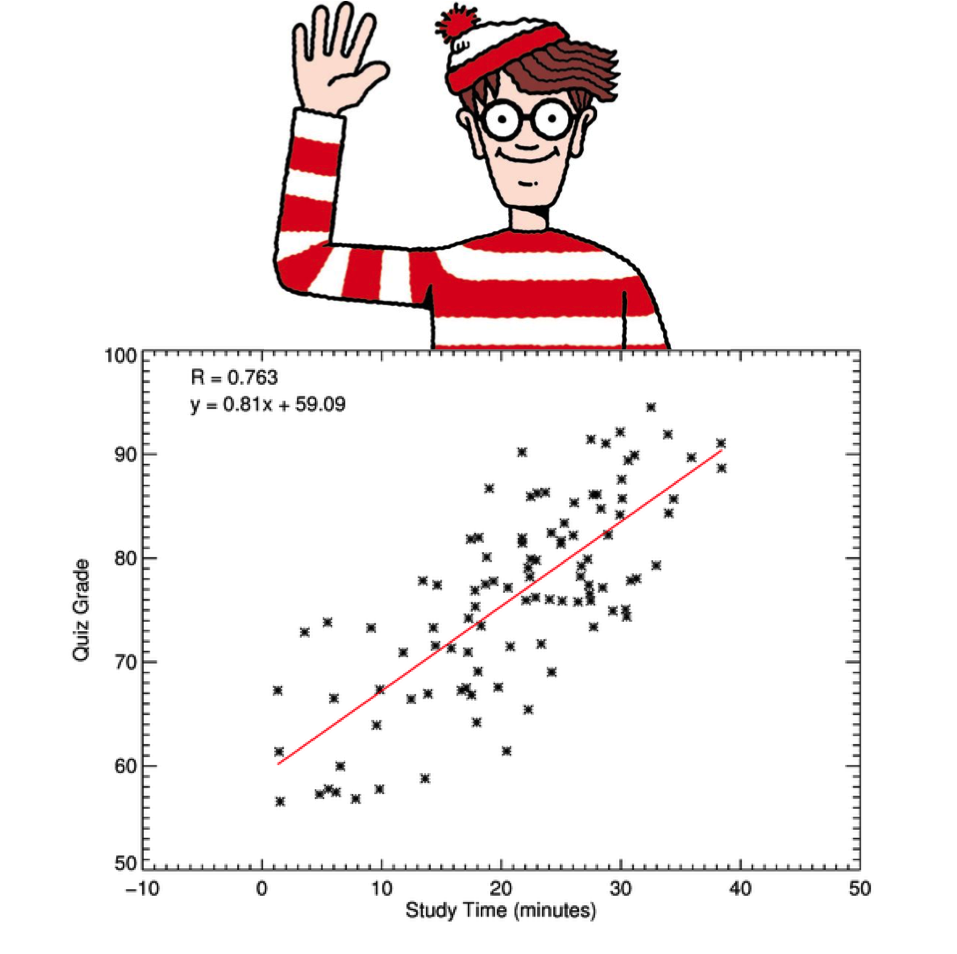
5. Correlation: How a variable changes with changes in some other variable
When I first read this long ago, it seemed too simple. But if you scrutinize the charts you create and encounter, and attempt to describe the underlying analyses using these five comparisons, I think you’ll find Zelazny’s framework by and large works.
And if so, I believe that leads to two very important questions:
1. How valuable is each of the five comparisons, relative to the others?
2. And how commonly do we use each of them?
The answer to the first question, of course, will vary given the problem under consideration, but generally speaking, I believe a strong case can be made that Correlation is most important. And by a pretty fair margin.
Why?
Because the first four comparisons only explain what is happening with a particular variable, while correlation seeks to describe why it is happening. And isn’t this really our goal in analyzing a situation? To understand why things are as they are, so we can adjust and make things better?
And if you share this view of Correlation, you might assume in answering our second question that it is the most commonly performed comparison.
But is it?
Again, the precise answer will vary depending on the situation, but in general, I believe correlation is actually the least common of our five comparisons. In scanning last week’s Wall Street Journal not a single scatter plot (the most popular chart type used in displaying a Correlation comparison) could be found. Not one. 68% of the charts depicted Time series comparisons, 16% Rank, 15% Component and 1% Frequency. Again, not a single Correlation.
How would these numbers change in the accounting of your analytical work?
I think it’s safe to say, we’d all be better off with a few more Correlation comparisons in the mix.

