A number of years ago I attended a day-long seminar on information design provided by the renowned expert, Edward Tufte.
While I admire and have great respect for his work, I took exception to a couple of his comments.
“There is no such thing as information overload, only bad design,” Tufte said at one point. And later he advised us to “always strive to build a super chart.” A super chart, in Tufte’s vernacular, is a chart with high information density, allowing the viewer to absorb more information in a single display.
While there is some good in this guidance – it forces us to think, to exercise our creativity, and to evaluate our data on multiple dimensions – it also contains a fatal flaw: it implies the writer/designer is more important than the audience. “I don’t care if you have to squint, twist your head sideways, and stare at this for five minutes, for I have constructed a beautiful super chart!!!”
I think the better guidance is this: Make every design decision with one purpose in mind: helping the audience understand your message as clearly and quickly as possible.
Now, this advice isn’t necessarily at odds with Tufte’s (I know what I would do if I was preparing a presentation for him), but often times our presentation output hinders audience comprehension. It makes them work. It makes it more difficult for them to make the very comparisons we intend.
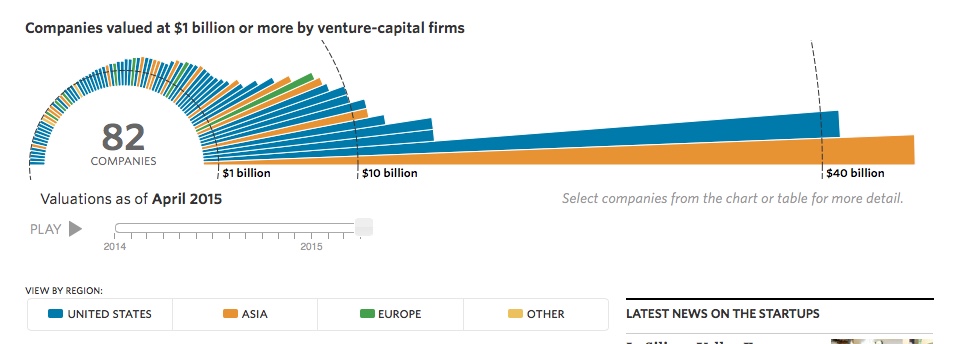
As an example, consider the following graphic from the Wall Street Journal, showing startup companies valued over $1B.
What do they want us to take away from this?
In short order, I recognize there are 82 companies over $1B in value, dominated by a couple of large ones, and that most of the companies are based in the U.S. (taking a quick glance at the color key). But I don’t know the identity of any of them. And I certainly can’t compare the valuations very well, due to the circular axis and the large scale (since most companies are on the small end). Wouldn’t a simple bar graph be easier for the audience to digest?
The actual graphic on the Journal’s website is dynamic in nature, showing how the number of companies has roughly doubled and their valuations grown over the past two years. It’s certainly “cool,” I imagine Tufte (and the Fonz) would approve, but is that ever really our goal in visual design? If so, I’d suggest our underlying message needs work.
Work on the impressiveness of the message, and keep the visual design simple. Remember, it’s all about the audience.

